How to Choose the Right Custom Sign Size for Your Porch
Size a porch sign from two numbers: one inch of letter height for every ten feet of viewing distance, and a board that fills about two-thirds of its available space. Measure the spot, decide where it will be read from, and work backward, then tape up a paper mockup before ordering.
A sign that is too small disappears against your siding. One that is too wide overwhelms the space. Getting the size right comes down to three measurements and one quick mockup step.
Why does porch sign size matter?
Custom signs are permanent enough that an awkward proportion will bother you every time you pull into the driveway. A sign sets the visual tone for the whole facade. One sized to fill roughly two-thirds of its available space reads as intentional; filling the full width looks cramped, and taking up a quarter of the wall looks like an afterthought.
The other consideration is legibility. Porch signs serve different people from different distances. A delivery driver needs to read your address from the road. A visitor needs to see your family name from the end of the walkway. Each of those use cases has a minimum letter height requirement, and the sign width is a function of how many characters need to fit at that height.
What measurements do you need before ordering a porch sign?
1. Available mounting width
Measure the width of the surface where the sign will hang. For a section of wall between windows, measure the clear space between the window trim edges. For a fence panel, measure the clear space between posts. For a door, measure the door itself.
Now take 50 to 70 percent of that width: that is your target sign width range. A 48-inch space between windows calls for a sign 24 to 34 inches wide. The exact choice within that range depends on your content and personal taste, but staying inside these proportions almost always looks right.
2. Primary viewing distance
Stand at the place from which most people see your porch first. For most homes, that is the end of the driveway, the sidewalk in front of the house, or the bottom of the front steps. Count your steps or estimate the footage.
This distance determines how tall your letters need to be. A workable rule is one inch of letter height per ten feet of viewing distance. At 20 feet, two-inch letters are the minimum. At 40 feet, four inches. For address numbers that need to be read from a moving car, the more conservative estimate of one-and-a-half inches per ten feet applies.
3. Line count and character count
Write out exactly what will appear on the sign: family name, house number, address, welcome phrase, year established. Count lines and the longest line in characters. A longer character string at your required letter height means a wider sign. If the resulting width would exceed your available space, the solution is either a shorter text line or a stacked two-line layout with a narrower per-line character count.
How do you size a porch sign, step by step?
-
Measure the available width
Record the usable mounting width in inches. Note any trim, fixtures, or brackets that cut into that space. Calculate 50 percent and 70 percent of the measurement to define your target range.
-
Find your primary viewing distance
Walk to the spot where people most often first see your porch and measure or pace the distance back to the sign location. Convert to feet.
-
Calculate minimum letter height
Divide the viewing distance by 10 to get your minimum letter height in inches. Round up to the nearest half-inch. For an address-number sign or any sign that needs to be readable from a moving vehicle, multiply the viewing distance by 0.15 instead for a more generous target.
-
Mock up the dimensions
Cut kraft paper or newspaper to your candidate size and tape it to the mounting location with painters tape. Stand back to your primary viewing distance and look at the proportion. This step shows a proportion mistake before the sign is made.
-
Confirm the content fits
At your minimum letter height and target width, check that your text fits without crowding. A useful rule: leave at least one letter-height worth of space between the text and each edge of the sign. If content is tight, either increase the width or split into two lines with a smaller sub-line.
Porch sign sizes by viewing distance
12x6 inches for a close-range door number, up to 18x6 for a name near a walkway, and larger widths for a full-facade or fence-panel piece read from the street. Aim for 50 to 70 percent of the mounting surface's width, then size letters to the viewing distance.
Proportion and visual weight
Beyond legibility, good sign sizing is about making the sign look like it belongs. A few principles that hold across most porch styles:
Height-to-width ratio matters. The sizes in the chart above run from 2:1 to 3:1 width-to-height. A sign that is much taller relative to its width reads as a vertical stake rather than a horizontal plaque. Going much wider and shallower produces a banner shape that can look temporary.
Horizontal centering outperforms edge-aligned placement. A sign centered on a porch wall or door section reads as considered. One shifted to one side usually looks like it landed there by accident unless there is a strong architectural reason for the offset.
Height from the floor affects perceived size. A sign at eye level (roughly 5 to 6 feet from the ground) appears larger than the same sign placed low or high. If your porch architecture forces the sign above or below ideal eye level, size up slightly to compensate.
Special cases
Signs on columns or narrow surfaces
A porch column gives you a narrow vertical canvas. For column-mount signs, the 50-to-70 percent width rule still applies but to the column face width, not the full porch span. A typical 6-inch painted column works well with a 4-inch-wide plaque. An 8-to-10-inch column can carry a 6-to-7-inch piece.
Address signs for emergency visibility
Emergency responders need to read your address from the street while moving. For address-only signs intended for street visibility, err on the side of large and use the one-and-a-half inches per ten feet figure above. Position the sign so it is unobstructed by parked vehicles or landscaping at the road angle.
Multi-sign groupings
Some porch setups pair a large family name sign with a smaller address or welcome sign below it. When grouping signs, treat the whole cluster as one visual unit and apply the proportion rules to the group as a whole. Matching materials keep the grouping coherent even when sizes differ.
Once you have the size
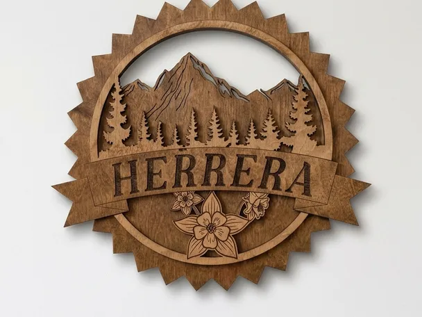
Two things decide whether a correctly sized porch sign still looks right in five years: the species it is cut from and the finish over it. Our guide to the best wood types for personalized signs covers which species hold crisp lettering and which move in weather, and how to seal a wooden sign for outdoors covers the finish that keeps it from graying. If you'd like to see how this math turns into a finished piece, the Custom Mountain Name Sign is round, and we cut it to the exact diameter you tell us rather than a fixed size list, so message us with the numbers this guide helped you land on.
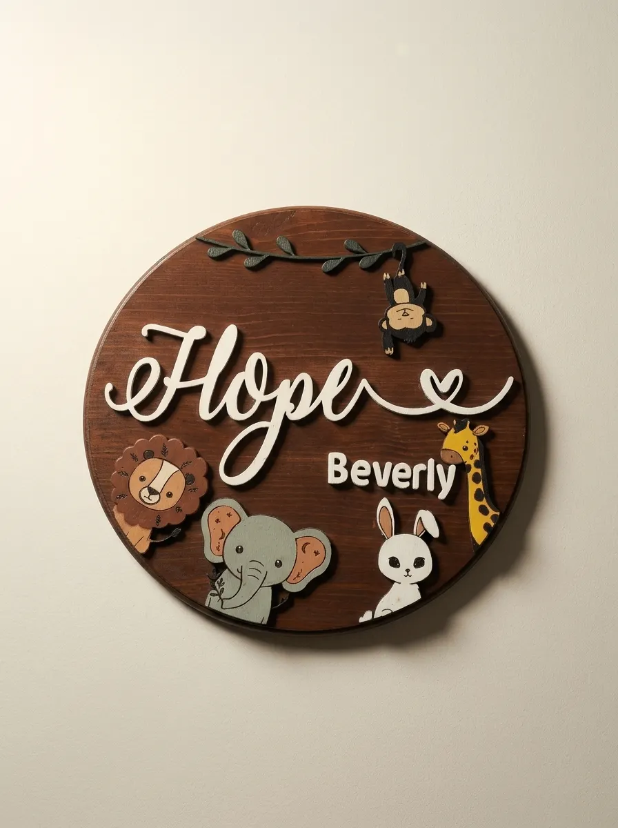
Indoor pieces skip the viewing-distance math above entirely. Our Personalized Safari Baby Name Sign sizes its round backer to the name's letter count instead, so a three-letter name and an eight-letter name both sit balanced rather than one crowding the edge.
Free guide
Not sure what size to order?
Get the Sign Sizing Guide: how to measure the space you have, how viewing distance sets the letter height you need, and the proportions that make a sign read well once it is up. We send the link by email.
Common questions about porch sign sizing
How big should a porch sign be?
Aim for 50 to 70 percent of the width of the surface it hangs on. A 48-inch span between window trim calls for a sign 24 to 34 inches wide. Filling the full width reads as cramped; taking up a quarter of the wall reads as an afterthought.
How tall do the letters on a porch sign need to be?
One inch of letter height for every ten feet of viewing distance. If people first see the porch from 20 feet away, two-inch letters are the minimum; at 40 feet, four inches. Measure from where visitors first look, not from the front step.
What size should house numbers be to read from the road?
Use the more conservative one-and-a-half inches of letter height per ten feet. Address numbers get read from a moving car by someone who has never been to your house, so they need more margin than a family name a visitor reads from the walkway.
What if my text is too long for the space I have?
Either shorten the line or stack it. Sign width is character count at your required letter height, so a two-line layout with fewer characters per line fits the same words into a narrower sign without dropping the letter height you need.
How can I check a sign size before ordering?
Cut a paper rectangle to the exact dimensions, tape it up where the sign will hang, and walk to your primary viewing spot. Five minutes with a tape measure and a scrap of paper catches a proportion mistake that would otherwise be permanent.
We cut custom sizes
Custom orders are cut to order, not from a fixed size list. If your measurements land at 22 inches wide or 27 inches wide, we build to that.
Tell us your available width and viewing distance when you place a custom order and we can suggest the specific dimensions that will work best for your text layout and display location. We build each sign in our own shop, so questions about sizing are easy to answer before anything gets cut, or browse what is ready now if a made piece already fits your space.
Measurements in hand? Our house signs collection shows real porch and entry pieces, so you can see how your numbers stack up against a finished sign before you order.